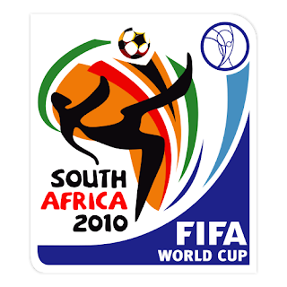
2010 FIFA World Cup™ - Official Logo
The 2010 identity is unique, vibrant and dynamic, graphically encapsulating the African continent while more intimately dipping into South Africa's rich and colourful heritage for inspiration.
The graphic figure strikes a resemblance to the earliest rock art paintings for which our country is also famous. This figure is caught in mid-action performing a bicycle kick - a style of play that captures the flair of African football.
The figure is lucid, energetic and indirectly illustrates an inherent passion for the beautiful game. It is kicking a football upwards - an invitation from Africa to other nations of the world to join the game.
The actual ball is a modern representation of a football, suggesting that it belongs to FIFA. And for the first time ever, this ball that has traveled across the globe will touch African soil.
The colourful backdrop behind the figure represents the South African national flag. The ‘swishes' extend upwards, from south to north, reaching out to the world. They embody the energy, diversity and fiery passion of our country, and they symbolise the rise of the rainbow nation.
The typeface is an original creation. It reflects our personality and reinforces the idea that in South Africa we do things uniquely. It is playful, naïve and free-spirited. It is also bold, welcoming and friendly.
The logo is celebratory in nature and energetic in its feel.
skip to main |
skip to sidebar
Popular Posts
-
Know the world of football is very necessary for the lover, one of the goals of the Wishbone: Slobbery Hound [VHS] (1995) is to it. then im...
-
Do You Love Action figure?. You should know that Momento Street Soccer is the stuff that you ought to have, its' great and, yes ..! yo...
-
Barcelona Home Messi Jersey 2013 / 2014 The Jersey fits well, looks authentic, is very nice and my son enjoys it very much. He wore the ...
-
if you love the soccer sport, then you are not going to waste your time to think about having Soccer: Goalkeeper Training for Speed, Coordin...
-
Do You Love Action figure?. You should know that Soccer's Greatest - Volume 10 - The Contenders is the stuff that you ought to have, i...
-
SOCCER: One Touch and Combination Play - Fast Break Attack Know the world of football is very necessary for the lover, one of the goal...
-
if you love the soccer sport, then you are not going to waste your time to think about having Soccer Training Girls & Women To Win: Disc...
-
Know the world of football is very necessary for the lover, one of the goals of the 1987 NCAA(r) Division I Men's Soccer National Champi...
-
The Czech WAG wanted to give her man a present that he could appreciate for his birthday, but struggled to find something that a fabulously ...
-
"There is no 'but'," says Slaven Bilić, adamant that his Croatia team will confound doubters and maintain their excellent ...
EURO FOOTBALL 2008
- euro2008 (154)
- football (144)
- news (101)
- soccer (94)
- sport (64)
- World Cup 2010 (42)
- game (35)
- outer game (18)
- tour (15)
- soundtrack (14)
- world cup history (9)
- Bastian Schweinsteiger girlfriend (8)
- Sarah Brandner (8)
- mascot (7)
- FiFA 2009 (5)
- SOCCER GEAR (5)
- stadium (5)
- Milan Baroš (4)
- Soccer DVD (4)
- final (4)
- supporter (4)
- Tereza Franková (3)
- World Cup Babe (3)
- countdown (3)
- jersey (3)
- world Cup (3)
- Free Wallpaper (2)
- soccer player (2)
- Manchester United (1)
- Sexy Soccer Calendar (1)
- ereza Franková (1)
- logo (1)
- lyric (1)
- soccer history (1)
SPORT LINK
EURO SOCCER 2008
-
▼
2009
(34)
-
▼
April
(9)
- World Cup 2010 - Count down widget
- Zakumi - a World Cup 2010 Mascot with attitude
- Zakumi the World Cup 2010 Mascot
- 2010 FIFA World Cup™ - Official Logo
- MIlan baros and Tereza Franková sexy Calendar
- Tereza Franková celebrating Milan Baroš birthday w...
- Beatiful Tereza Frankova huge Milan Baros
- Tereza Franková The Sexy Fiance for Milan Baroš
- Lindsay Tarpley : The two time Olympic gold medal ...
-
▼
April
(9)
Blog List
ABOUT EURO 2008 SPIRIT
EURO 2008 FOOTBALL
euro2008
~
football
~
news
~
soccer
~
sport
~
World Cup 2010
~
game
~
outer game
~
tour
~
soundtrack
~
world cup history
~
Bastian Schweinsteiger girlfriend
~
Sarah Brandner
~
mascot
~
FiFA 2009
~
SOCCER GEAR
~
stadium
~
Milan Baroš
~
Soccer DVD
~
final
~
supporter
~
Tereza Franková
~
World Cup Babe
~
countdown
~
jersey
~
world Cup
~
Free Wallpaper
~
soccer player
~
Manchester United
~
Sexy Soccer Calendar
~
ereza Franková
~
logo
~
lyric
~
soccer history
~


